Tableau, while allowing a great range of formatting options, is limited in options specifically for making things look nicer. Well, that isn’t entirely fair; but there are a lot of things it can’t do that people who are graphic designers at heart would love it to be able to.
For example, you can’t round corners. You can’t edit formatting of input boxes and dropdowns. You can’t have layers without floating elements. And, you can’t add a drop shadow. However, if you’re fanging for a drop shadow, this will show you how to mimic one, which is just as good as having it for real.
Creating a Drop Shadow on a Floating Container

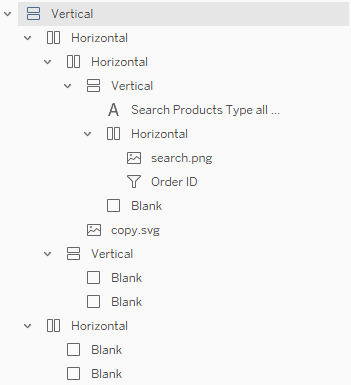
The basics of this boils down to adding thin slivers of darkly coloured Blank objects to the side and bottom of the main container. Then, tiny white Blank elements are added near these to make the shadows be offset. By tweaking the height of the shadow objects, and the size of the transparent objects, you can effectively change the y-offset and x-offset of the shadow. Unfortunately, I can’t think of a viable way of achieving blur (without creating a stupid number of containers that mimic blur. This would be stupid.).

This search box is an example of a popup you can create using a structure like this:


This is just a proof of concept – showing that it can be done. Go forth and experiment… I hope there are other applications of similar elements.
I’d like to note, however, that this technique is purely for aesthetic benefits. There is no real user experience or usability benefits that comes from this idea. In a real business setting, you probably wouldn’t want to waste time on doing this unless you needed to really ‘wow’ somebody with the design.