“Data-Ink?” you say? It’s an odd name, I agree, but what it represents is fundamental to excelling in visual analytics.
Data-Ink is a concept introduced by Edward Tufte in his 1983 classic The Visual Display of Quantitative Information. In it, he states
“Data-ink is the non-erasable core of the graphic, the non-redundant ink arranged in response to variation in the numbers represented.”
Tufte asserts that, in displaying data, we should remove all non-data-ink and redundant data-ink, within reason, to increase the data-ink-ratio and create a sound graphical design.
What does all of this mean?
It essentially boils down to removing things that, when you think about it, don’t need to be there. Take a step back and consider your dashboard or chart from the perspective of someone who’s never seen it. Every element on a graph should serve a purpose, and if a title, legend, or axis label isn’t necessary: chuck it!
The name is odd because it comes from the old days of literally drawing graphs out (or printing them). The name refers to the ink used on paper – and how much of that ink is actually necessary to tell the story you’re trying to tell.
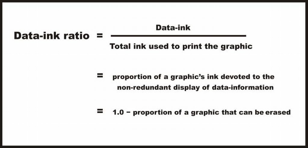
Non-data-ink refers to elements on a graph that do not add any information or insight to the graph or do not represent a piece of data. Redundant data-ink refers to the elements on a graph that are already represented by another element or facet (e.g. a colour legend when there are already axis labels).
Bar Chart Example
Here’s an example that shows a few examples of removing redundant data-ink.

You can probably tell that something is wrong here… It isn’t always immediately obvious, but when you start to study the chart, you’ll find a few things that violate data-ink principles:
- The bars are coloured by the same dimension on the axis, which literally adds no additional information (and, in my opinion, makes it look worse)
- The legend is repeating information from the graph (colour and label)
- There is too much flair: background textures, unnecessary lines, borders, etc.
- The axis titles are a bit superfluous given the title
- Titles and text are a bit over explained
Applying data-ink principles gets us somewhere like this:

There’s a few things different here:
- Firstly, the axes have been completely removed, and the specific numbers have instead been added as labels.
- The colours have been removed as they didn’t add anything
- You may be wondering what the colour now represents. Well, it can be the selected value (used in cross-filtering), or it could be the stand-out value that you want to draw attention to. Anything that makes Bacon different from the others, apart from the fact that it is a different food type (which is already shown via the labels)
- Superfluous formatting has been removed (shadows, lines, borders, reference lines, backgrounds)
- Colour legend has been removed
- The title has been shortened, as the ‘different foods’ part is obvious
Overall, it gives the chart a much lighter feel, and it can be said that all elements on that chart are providing their own piece of unique information.
It is good to note that removing colours by dimensions isn’t always the best approach. I usually keep colours if they are also used elsewhere in the dashboard to differentiate those dimension values.
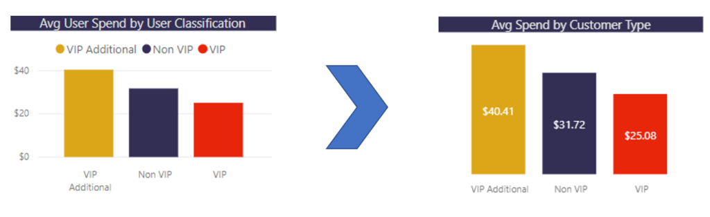
Table Example
Here’s another example of applying data-ink, but to a table.
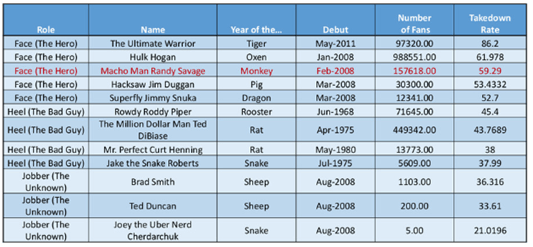
Oh dear. Okay. A lot is going on here.
- There are lots of duplicated values in the Role column
- There might be too much information in the Number of Fans field
- The colours are a bit much
- The grouping based on Role is not super obvious
Applying data-ink…

Here we have done a few things:
- Merged the Role values to show grouping better
- Added more spaces between the different roles to also help with showing groups
- Removed a lot of the lines (not really necessary for a table this small)
- Removed colours
- Bolded the call-out value
- Changed the Fans figure to be in thousands and dialled down the decimals
- Right-aligned some of the columns, left aligned others
So, what now?
Data-ink principles are not just good to know for development, they are also incredibly useful for reviewing existing dashboard elements. Go back to your dashboards and do a bit of a review: could any of your charts or tables be simplified using data-ink principles? If so, you know what to do. If not, good job!
Go forth and apply data-ink principles. It will change your life.
1