
Function over form. This is the mantra repeated by all great dashboard and report developers, and for good reason. But does this principle mean that form should suffer? And could it be possible to extract function from form? I posit that, in many cases, form is function. In particular, the application of User Experience (UX) principles can enhance the usability of a dashboard and, ultimately, improve the ability for users to extract insights and information from it.
Form is Function
Well, more specifically, the right form can be function. I’d like to put forward the following idea:
The thoughtful application of user experience principles to an analytics dashboard can enhance the ability of users to extract insights and information. Which is, after all, the ultimate goal of a dashboard.
That doesn’t sound so crazy, right? Why don’t we get into it a bit more.
The User
 A major theme I have encountered during my experience as an analytics professional is that when reports are made for people, they end up finding them hard to use. In the end, they are unable to extract the business insights from all of the hard work that has been poured into the dashboard or report. Why is that? Generally, it’s because the user wasn’t thought of during the development process.
The end users of a dashboard are the key resource for understanding whether a dashboard will be useful or not. They are the ones that inform whether the right information can be extracted from the report you’ve built. They are the ones that will tell you if you’re going down the wrong path. And ultimately, they are the ones that will tell you if you’ve nailed it. Too often the users are ignored, and the developer creates the report according to what is doable; according to what the data can achieve. This can lead to a few major problems:
- Over complication
- Straying from the intended focal point
- Superfluous features
- Information that isn’t needed
- Wasted time
User Experience
As many of you may know, user experience (UX) is about making deliberate and thoughtful design decisions to maximise the usability of a product.
User Experience for Analytics Dashboards
If you research user experience design, you’ll find a plethora of principles and methods to improve the overall ease-of-use of a given product. However, not all of these are applicable to dashboard design. There are, however, some fundamentals that will help improve your dashboards quickly.
Progressive Disclosure
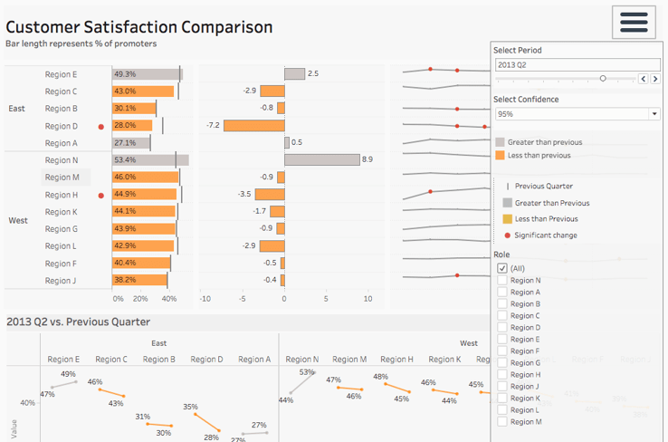
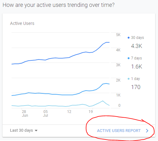
The first principle that is highly relevant is ‘Progressive Disclosure’. The key of this idea is that you should only be showing what the user needs or wants to be seeing at a particular time. That is, progressively disclose the information in a logical manner (often dictated by the user themselves) so as to not overwhelm the user from the get-go.


An example of this in the wild is the iOS weather app. The first screen you see shows relevant information that most people would want to see upon opening the application (temperature, rain prediction, forecasts, etc.). But, if you desire, you can scroll vertically and horizontally to show more detailed information such as the atmospheric pressure, UV index, and sunrise timings.
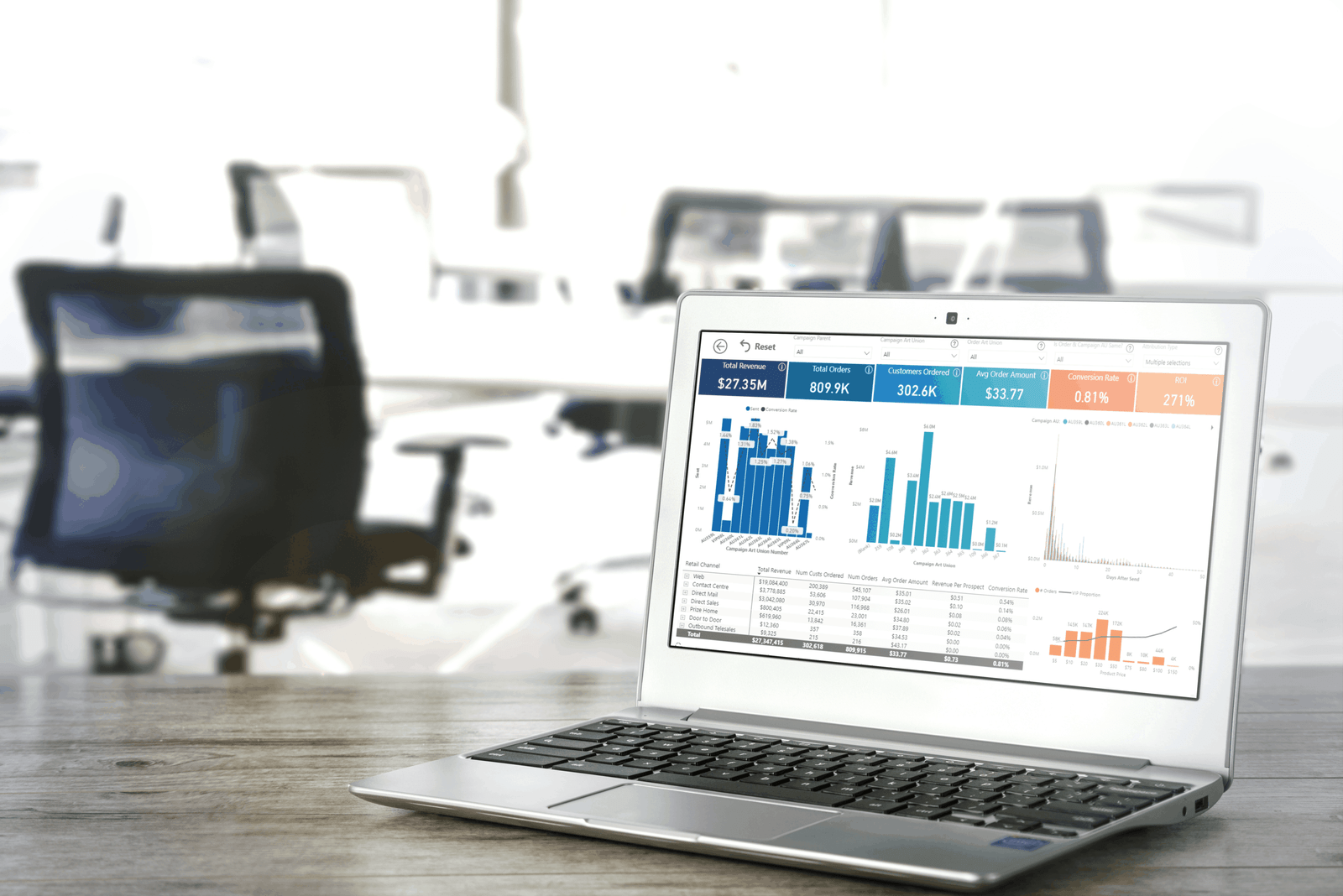
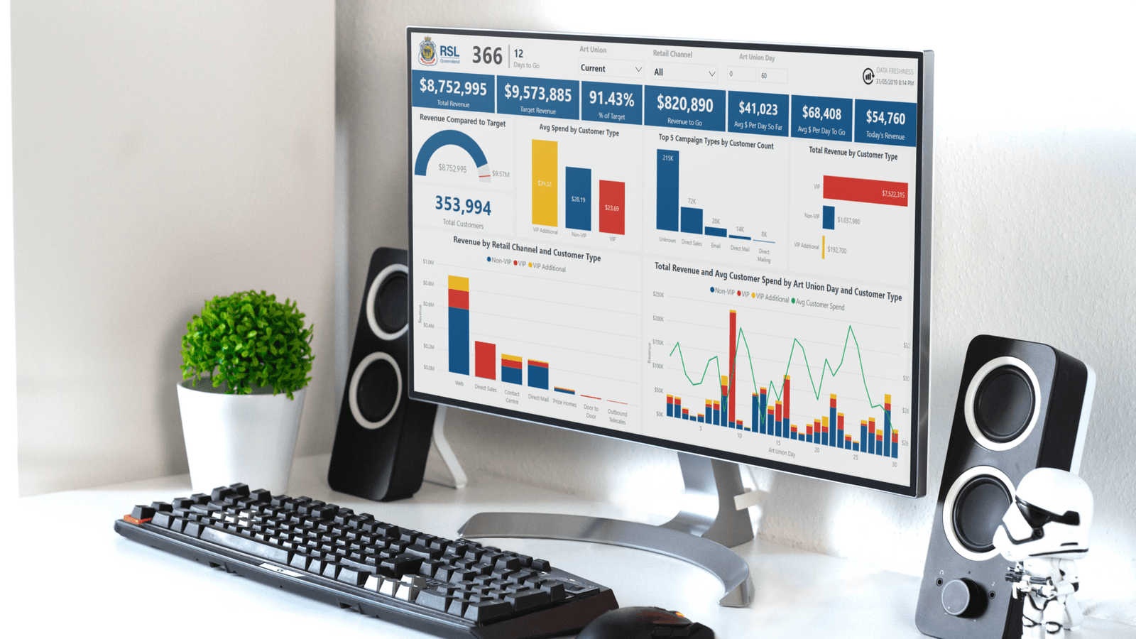
You can apply this to your dashboard designs, by hiding things such as filters, slicers, or detailed breakdowns until people want to see them (e.g. charts on tooltips or menu-like filter sections). Another way of applying this is by having multiple levels of a dashboard, where the user can drill down into a specific area to find out more (and sometimes even get down to row-level data.
Conclusion
As analytics becomes more democratized and easy to use, your differentiating skills as an analyst are changing. User Experience in a dashboard or report is important in enhancing the usability of your work, which is highly correlated with the amount those reports are used.